
Fighting Drop-Off, Building Trust: Crafting Intuitive Onboarding for 7M+ Users
Product Designer – Cybersecurity
The Problem
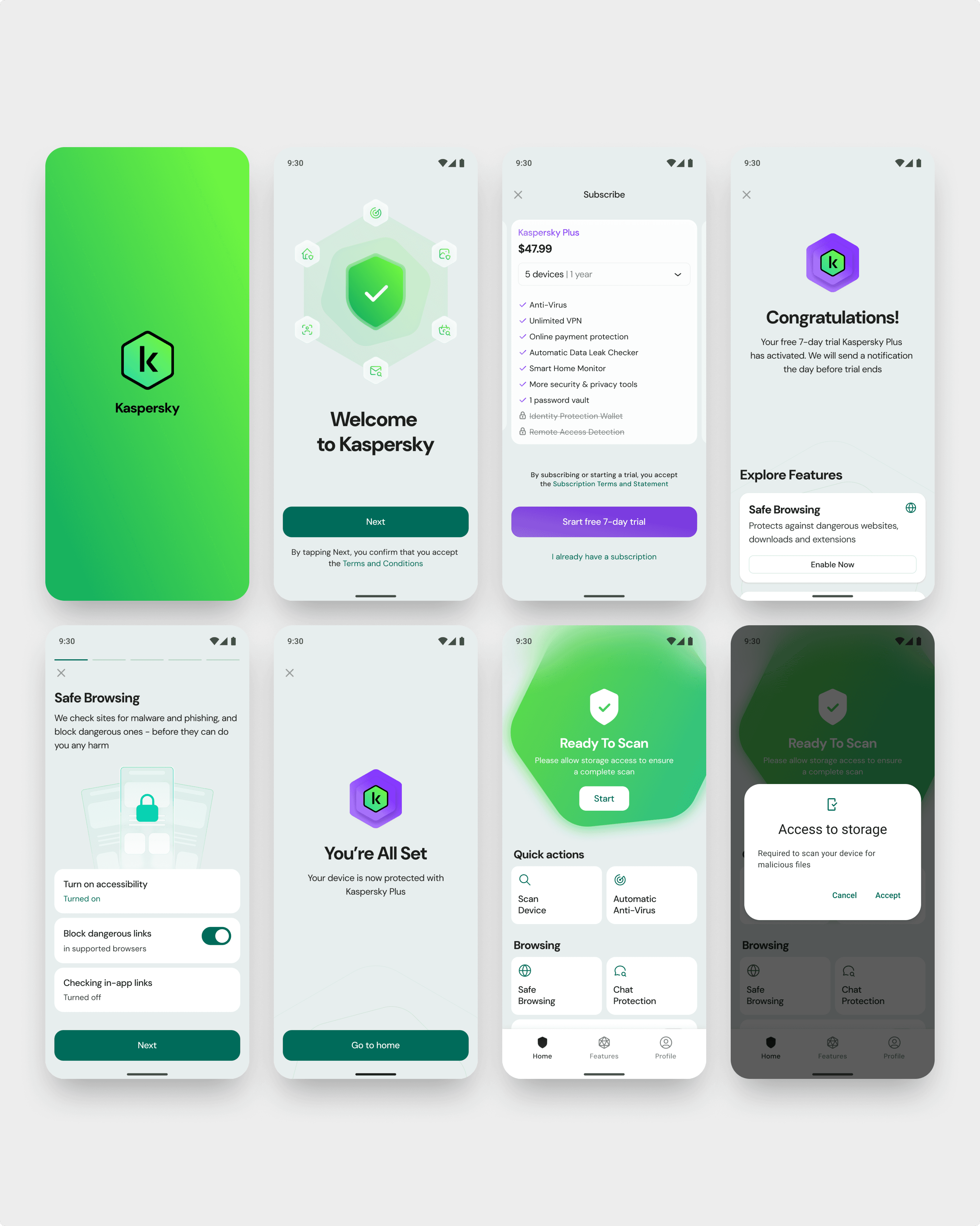
Kaspersky's mobile antivirus app faced significant drop-offs during the onboarding process. A third of users exited at the Terms and Conditions stage, and fewer than half completed the Sign-In step. This hindered product activations and reduced subscription rates, as users found the onboarding lengthy, unclear, and anxiety-inducing.
Design and Development
To optimize the onboarding experience, we started by analyzing user behavior and identifying key drop-off points. With these insights, I explored multiple onboarding scenarios, sketching and prototyping different user flows. Through iterative testing—both internally and with real users—we validated our solutions, refining each step based on feedback. Our approach prioritized clarity, reducing friction at every stage while maintaining compliance with security and legal requirements. This data-driven, iterative process resulted in an intuitive, engaging onboarding experience that significantly improved activation rates.
The Solution
We focused on redesigning the onboarding experience to boost conversions from installation to activation. Key improvements included:
Streamlining Processes: Combined agreements into a single step, simplified navigation, and clarified permissions.
Building Trust: Used a warm, welcoming tone and clear guidance to reduce user anxiety.
Enhancing Clarity: Improved descriptions of subscriptions, features, and benefits to increase user confidence.
Iterative Testing: Conducted user research, tested flows, and refined designs based on feedback.
Scenario 1: New Subscribers
For users subscribing for the first time, the onboarding flow emphasized a premium experience. Clear guidance was provided to highlight the value of advanced features, ensuring subscribers felt confident and satisfied with their decision. This flow prioritized showcasing the app’s benefits while maintaining a seamless activation process.
Scenario 2: Free Users
In this scenario, I designed an onboarding flow for users opting to use the app without subscribing. The goal was to ensure that the free experience remained valuable while subtly introducing the benefits of premium features. By focusing on simplicity and transparency, I minimized user drop-off and maintained a positive perception of the product.
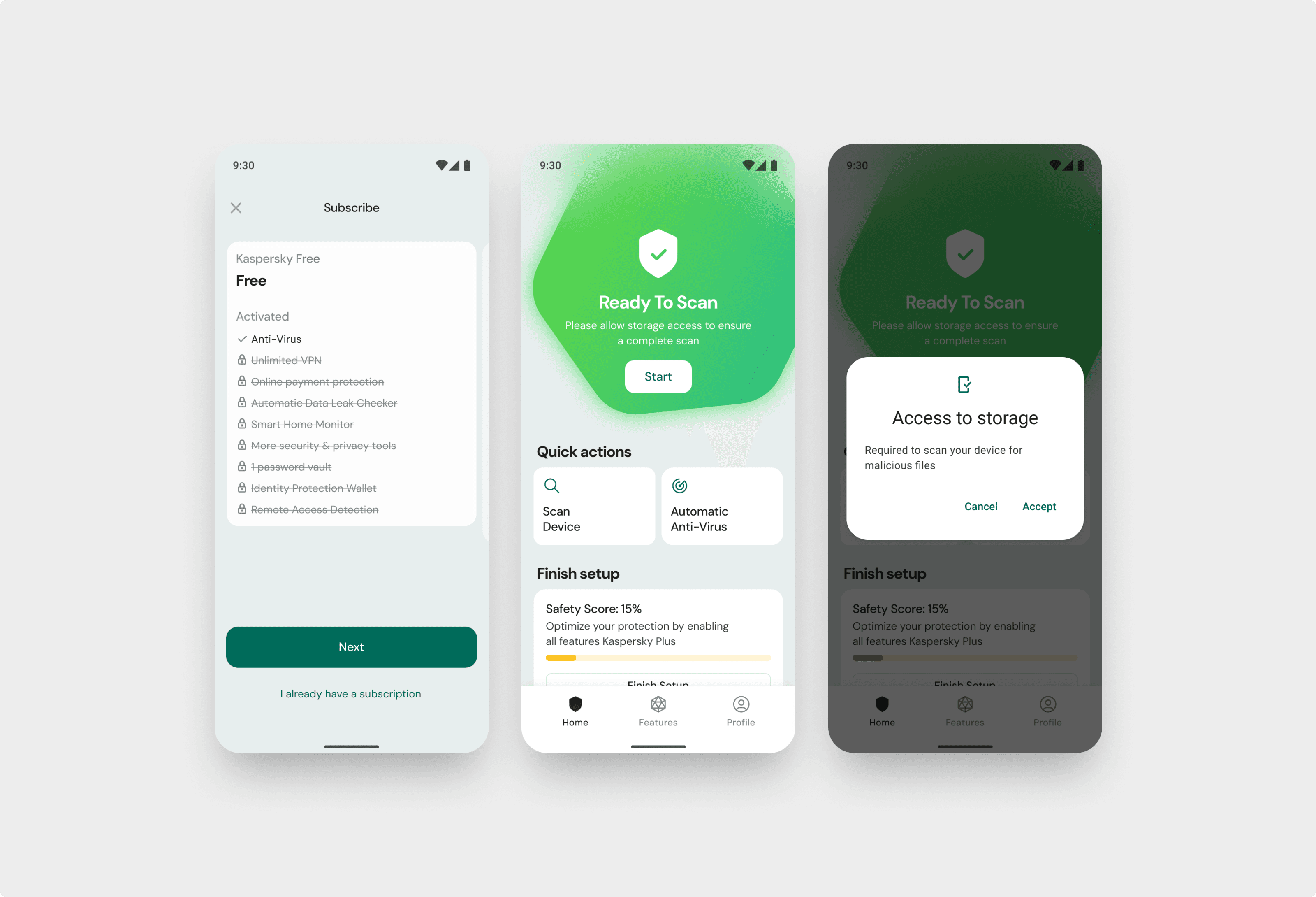
Scenario 3: Restoring a Subscription
For returning users restoring an existing subscription, I developed a flow that facilitated quick and intuitive reconnection. This scenario focused on providing clarity and continuity, allowing users to regain access to their premium features with minimal friction and without compromising security.
These distinct flows demonstrated my ability to address diverse user needs while maintaining a cohesive and efficient design approach.
Results and Achievements
Our redesign significantly improved the onboarding experience:
128% growth in paid subscriptions year-over-year.
Enhanced user satisfaction with simplified flows.
Increased retention through trust and engagement.
By addressing key pain points, we created an intuitive onboarding journey that built loyalty and drove growth.